Designing the platform architects use to understand climate.
Product Design·
UX Research·
AI-Assisted Design·
Product Communication
One year as the only designer at a climate tech startup. My job was to understand what users actually needed and design a product that delivered it.
The platform had strong technical foundations but had grown without dedicated design input. Onboarding, navigation, and data presentation had room to improve.
I ran usability studies, redesigned key platform features, built the plugin icon system, and led the audience research and communication strategy.
1,300+ projects optimized, climate reports in under 5 minutes, measurable performance gains, and a design foundation the team can build on.
80% of buildings have no climate assessment. Traditional simulations require specialist software, weeks of setup, and budgets of tens of thousands, putting climate-informed design out of reach for most projects.
infrared.city changes that: AI-powered simulations for wind, solar, thermal comfort, and heat stress, directly in the browser, for any project, at any scale.
Here's how a project actually moves through the platform, from an empty map to a shareable climate report.
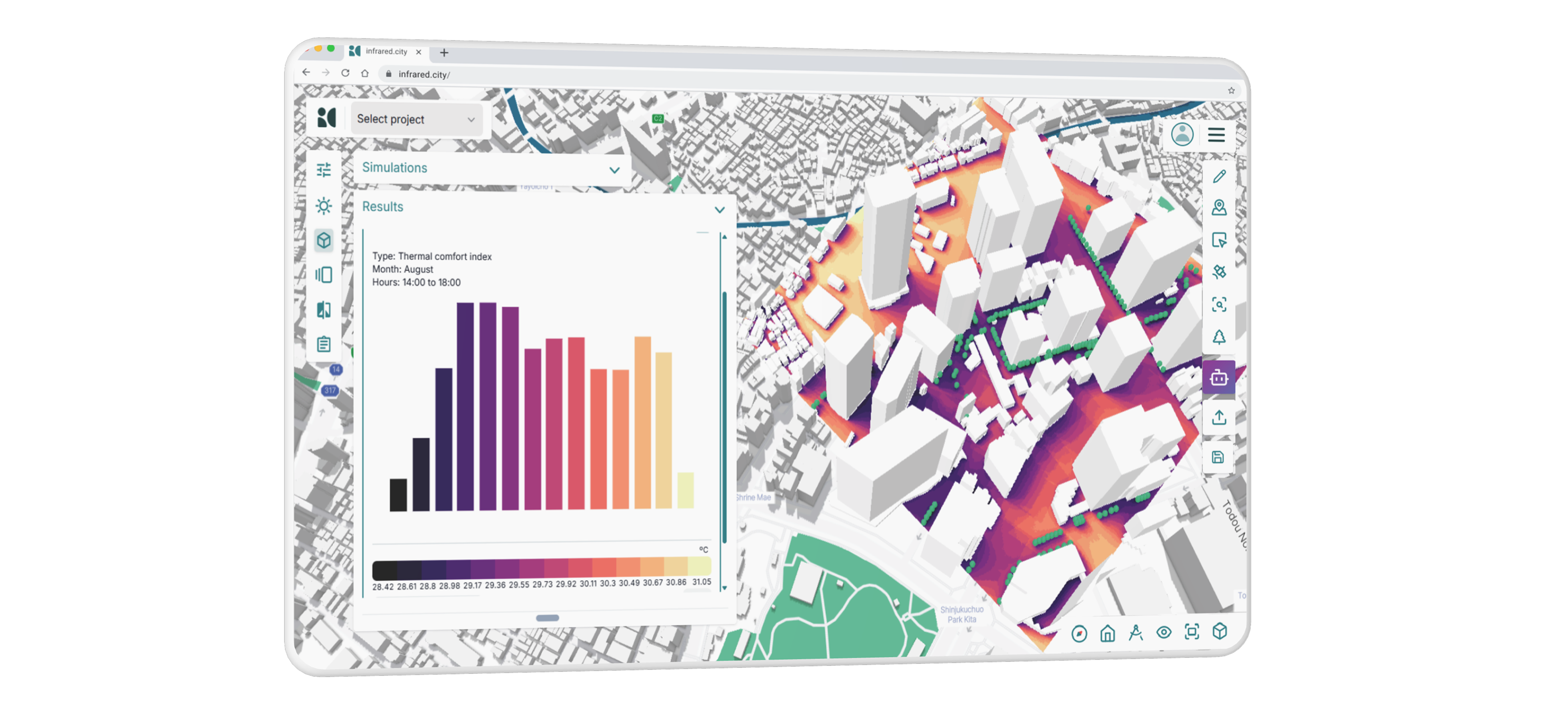
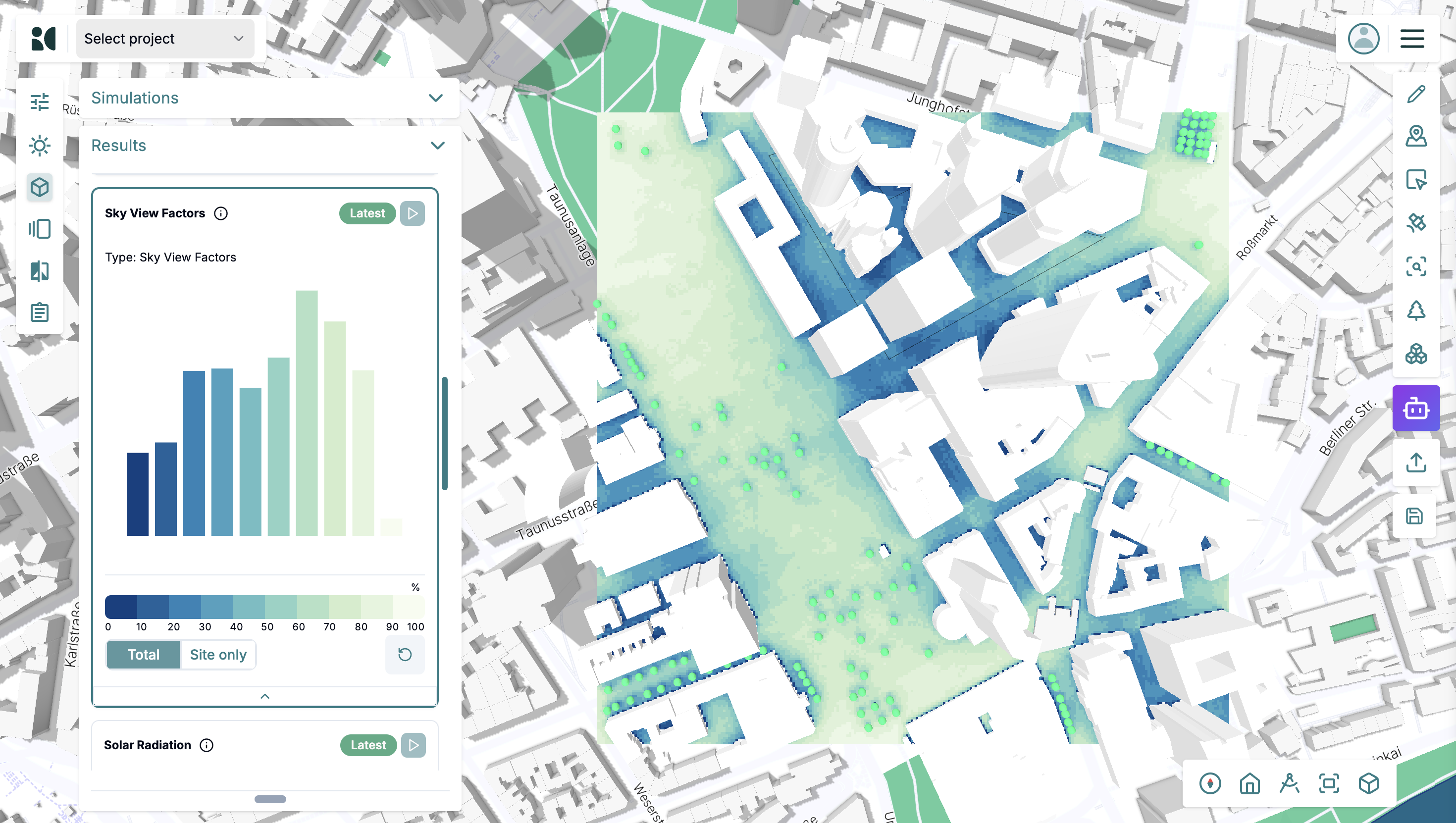
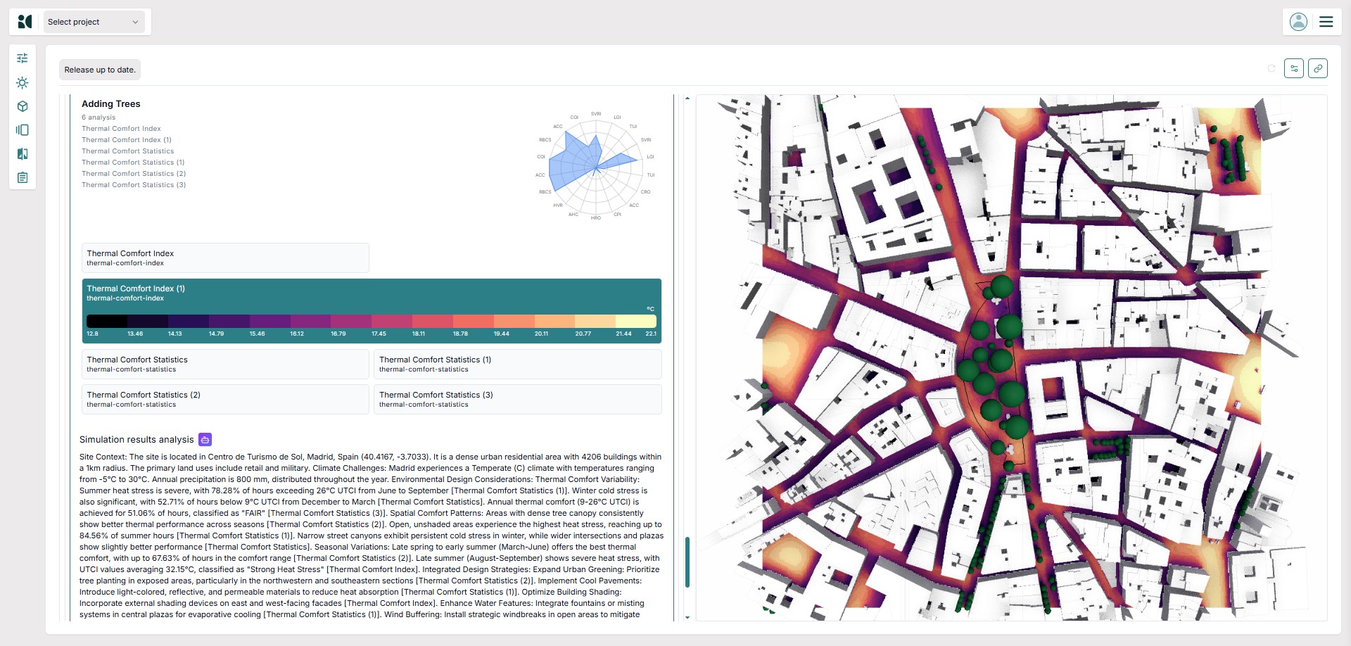
infrared.city platform — thermal comfort simulation overlaid on a 3D urban model.
I was designing a platform for architects.
I'm not only a product designer.
I'm also an architect.
My architecture background gave me two perspectives at once. As a potential user, I understood the workflows, the project pressure, and where a confusing interface costs real time. But because I wasn't part of the team that built the product, I could also see it with fresh eyes, recognising what wasn't working without the assumptions that come from being too close to something.
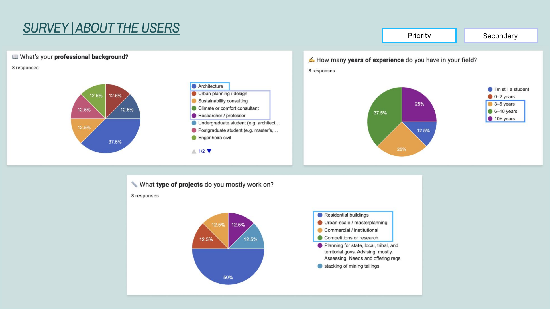
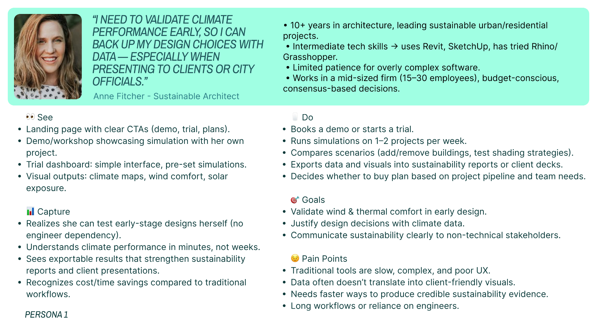
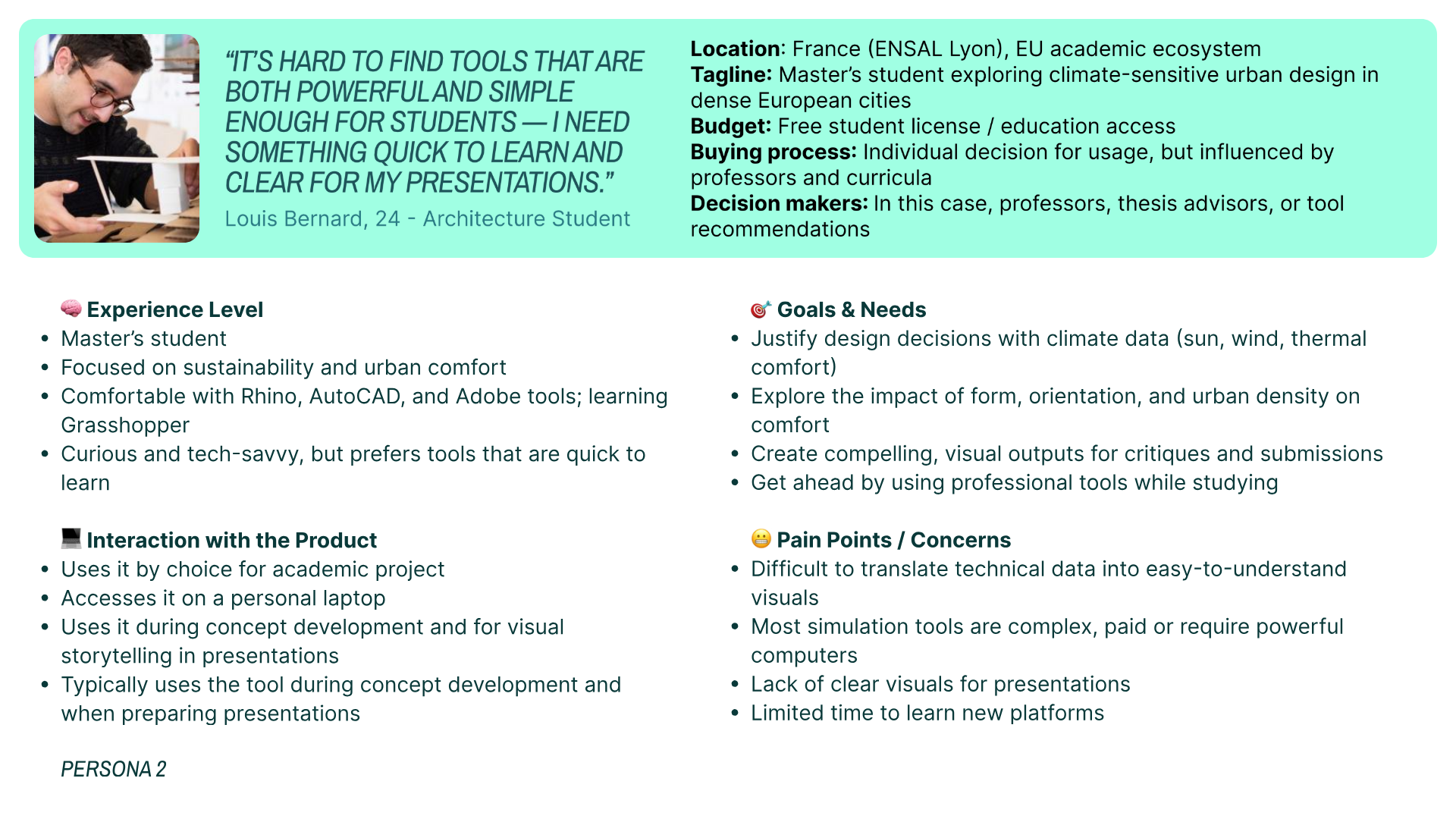
infrared.city could serve architects, students, researchers, city planners, and more. Trying to speak to all of them meant speaking clearly to none. I ran competitor analysis, drafted personas, and used direct observation through usability sessions and a user survey to understand who they were and how they actually used the product.
Two personas built from the usability study and internal feedback, representing the two most differentiated user types on the platform.
Before designing anything, I needed evidence. I combined task-based usability testing with semi-structured interviews to understand where the product was failing and why. Each finding mapped to a real user struggle, not an assumption.
"Where do I create a project?"
Onboarding task
"I just need the basic information when I create a project."
Post-session interview
"Is the wind stronger when it's red? Or when it's blue?"
Climate section task
The research made it clear where to start. Each design response maps directly to a finding. Nothing was designed speculatively.
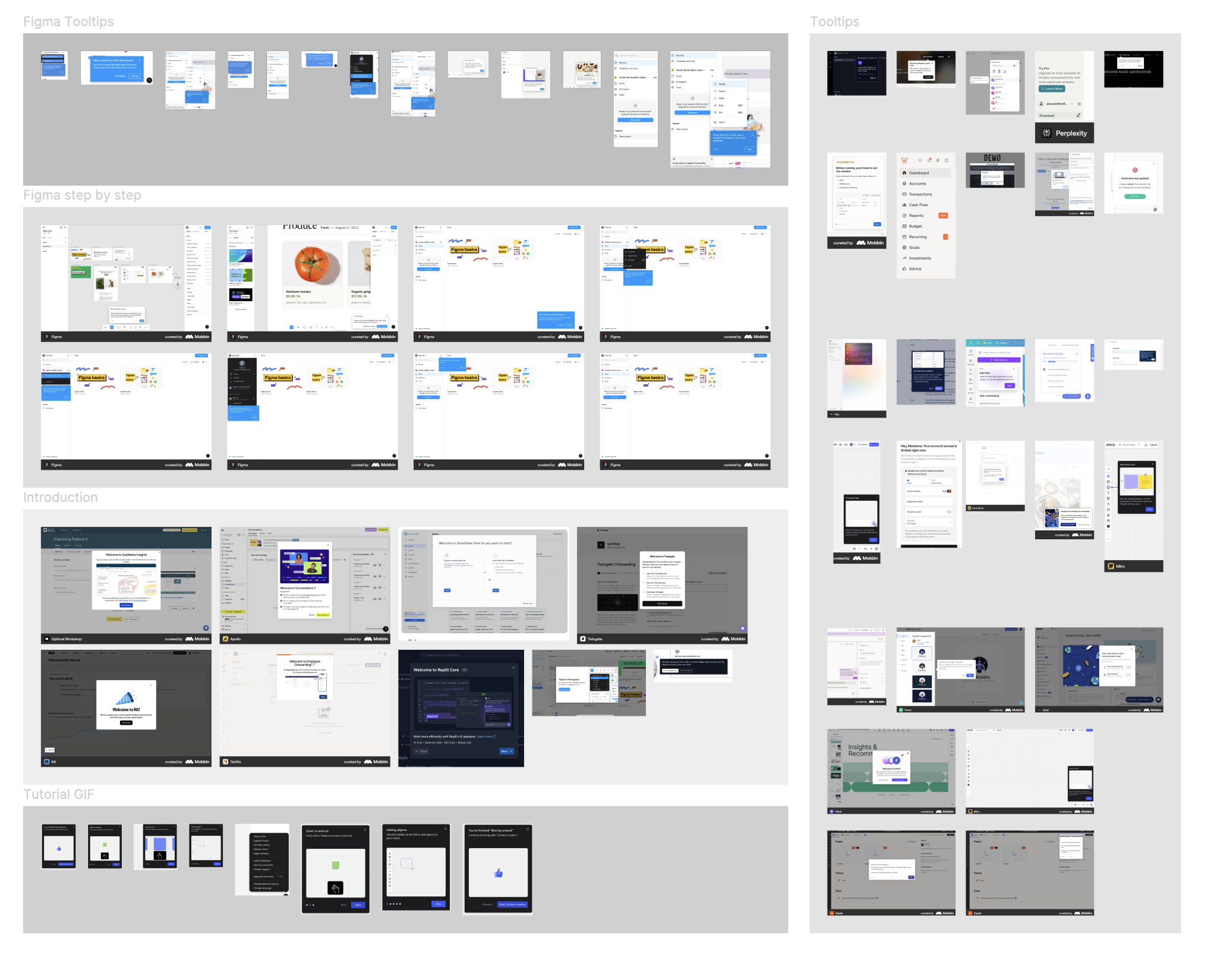
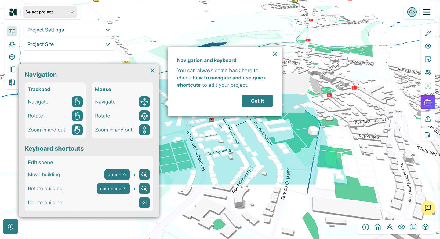
The biggest friction point was the first 60 seconds. I benchmarked 8 B2B SaaS products, then designed a 9-step contextual quick tour using Product Fruits, each tooltip mapped to a specific panel, guiding users in context. I proposed always keeping one mode active (navigate or edit) so users always know where they are. I also surfaced "Create new project" to the top of the dropdown, making the primary action immediately visible.
As the Revit and Grasshopper plugins evolved, new actions kept emerging. I designed the full icon set from scratch, using colors outside the main brand palette so plugin icons are immediately recognizable inside those environments. Low effort, high impact.
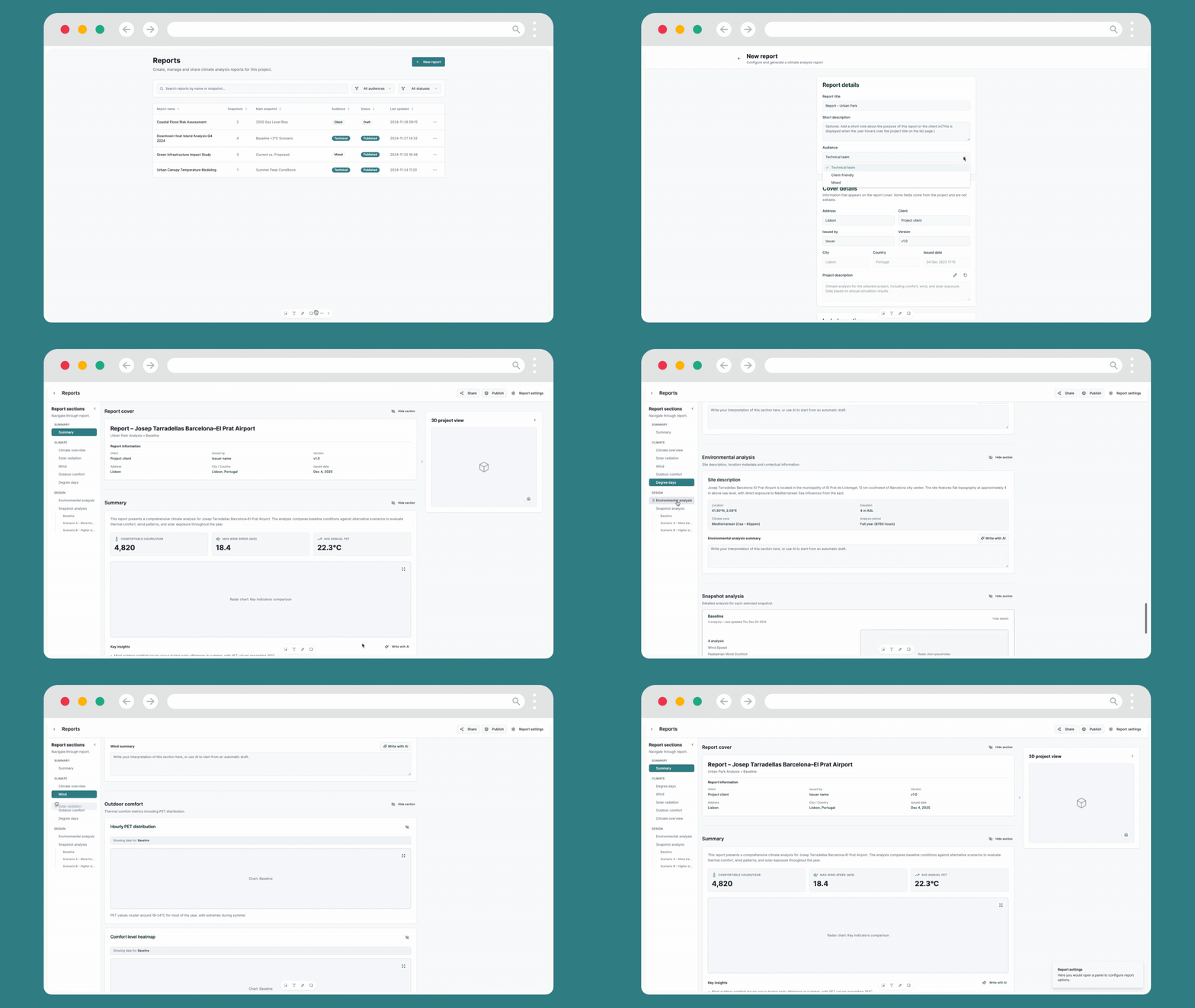
The reports feature was the most critical part of the product. It is what architects share with clients and planning authorities. If it was broken, the platform's value did not reach the end of the chain. It was also the feature furthest from production-ready.
I used Lovable alongside my own UX direction to prototype and rebuild the reports system in Figma. The before and after shows how dramatically the experience changed.
No information hierarchy, no audience targeting, no AI writing support. Sections were visually uniform and navigation made it hard to orient.
The new system has structured navigation by section, audience selection that adapts content density, AI writing integrated per section, key metrics in the summary, and a clear management dashboard with status and filters.
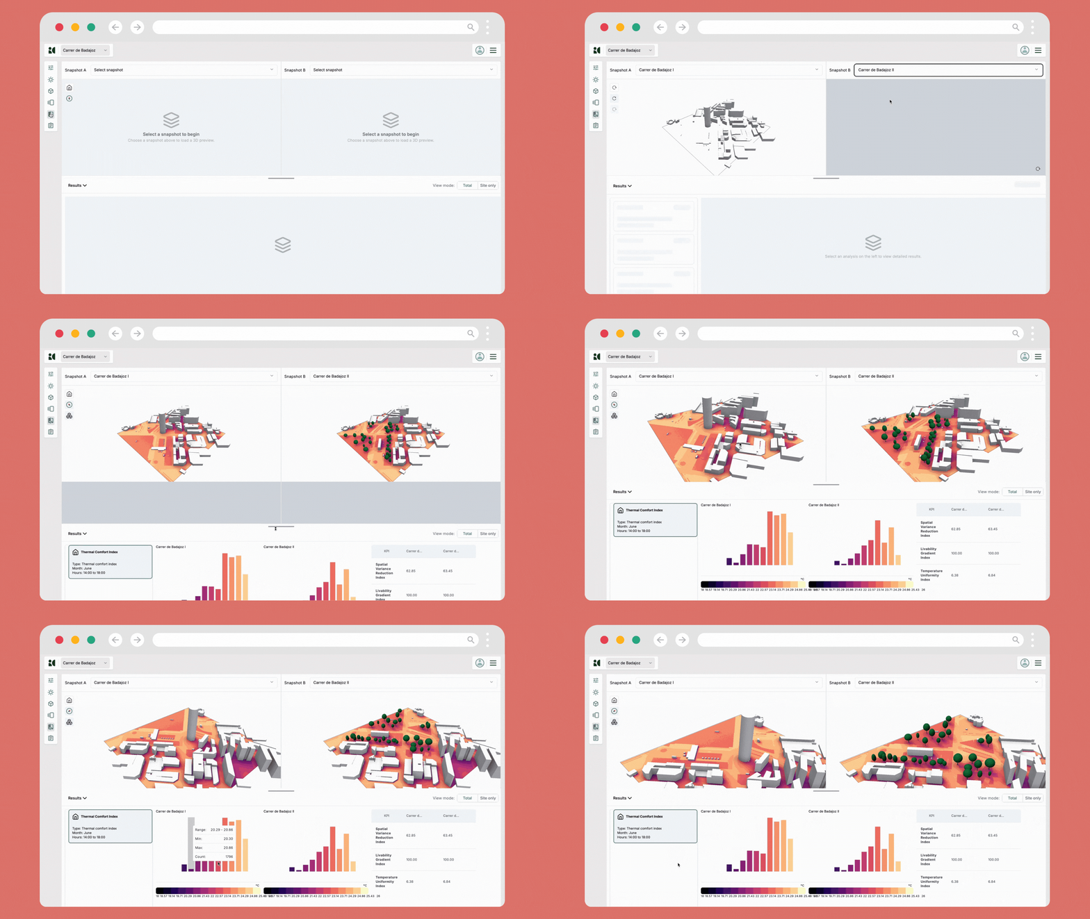
The comparison feature lets users evaluate different design scenarios side by side: baseline vs. more trees, baseline vs. higher density, for example. The original version made it difficult to understand what was being compared and why the numbers differed.
I rebuilt this page in parallel with the reports system, establishing a consistent visual language between the two features.
No customization, no way to adjust what was being shown or how.
Adjustable panel sizes, empty states guiding each step, and a clearer data hierarchy.
The team rebuilt parts of the platform with AI assistance. Using Claude Code, I reviewed the output systematically: checking for hierarchy issues, inconsistent component usage, broken flows, and copy that did not match how real users actually spoke.
AI can produce interfaces that look correct but fail on usability. My role was the design judgment layer between AI output and the finished product.
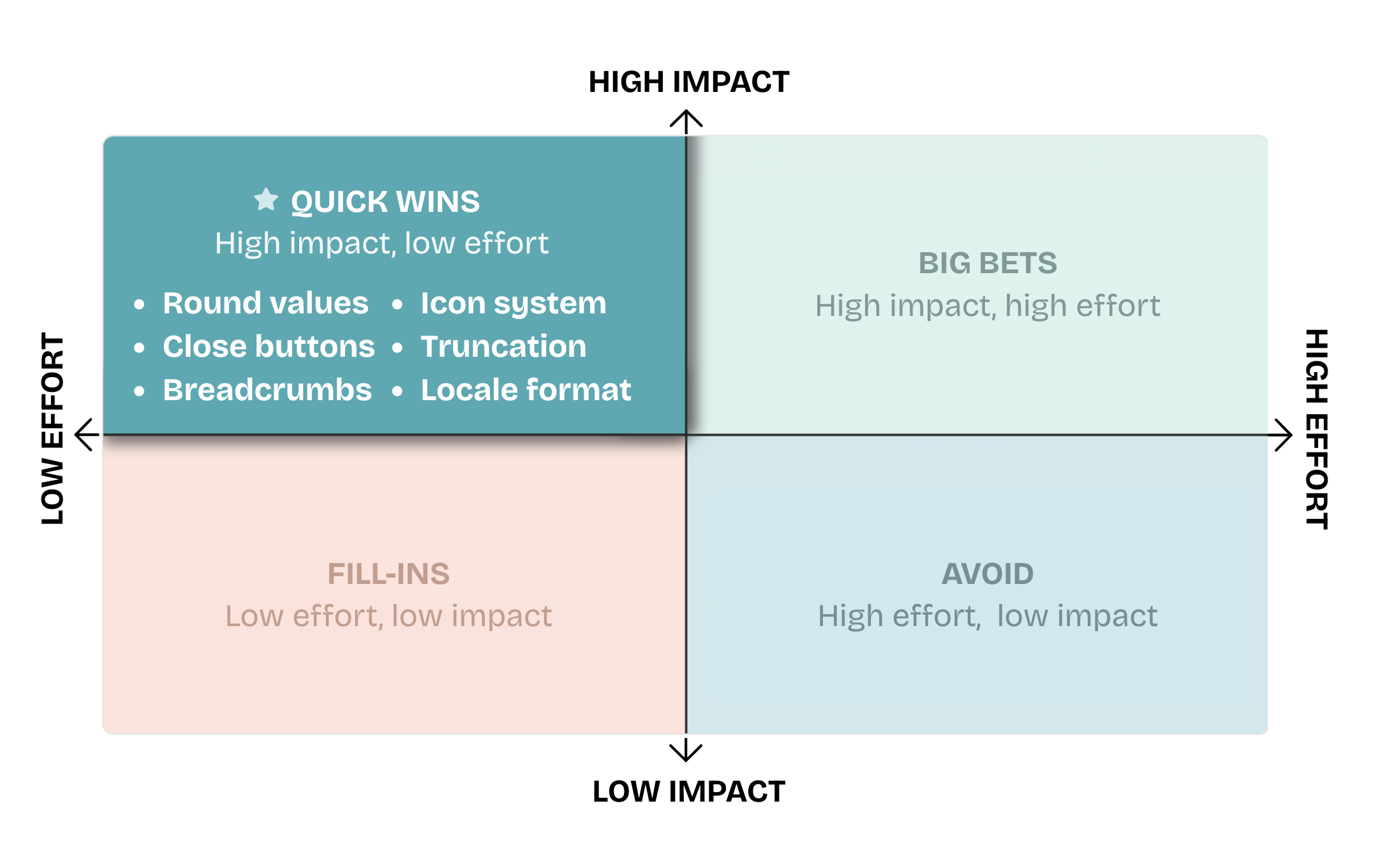
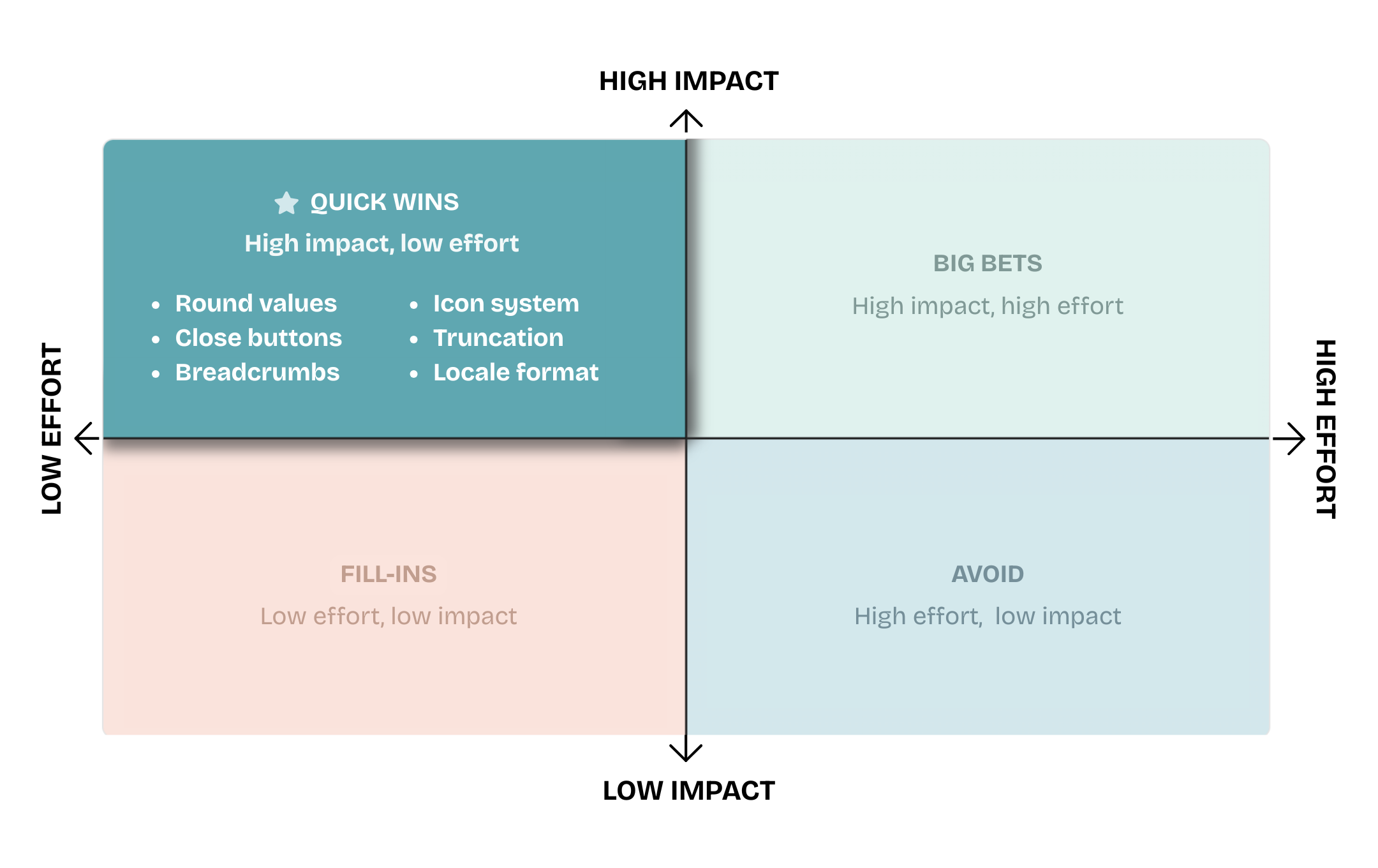
I organized all 18 findings across four categories, then prioritized 6 as quick wins: low-effort, high-impact changes.
6 issues flagged for immediate resolution, prioritized by impact and effort
Claude Code became a constant tool across the entire process: meeting transcription, brainstorming, audit organization, and systematic design review. Work that would normally take 3 weeks was completed in 3 days.
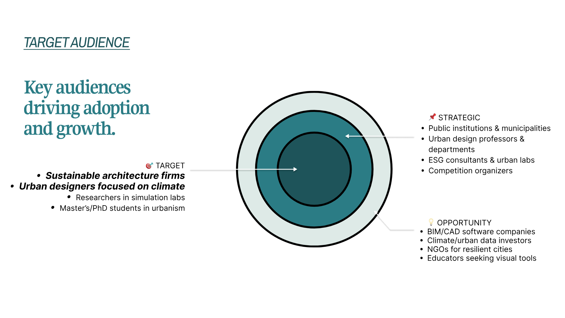
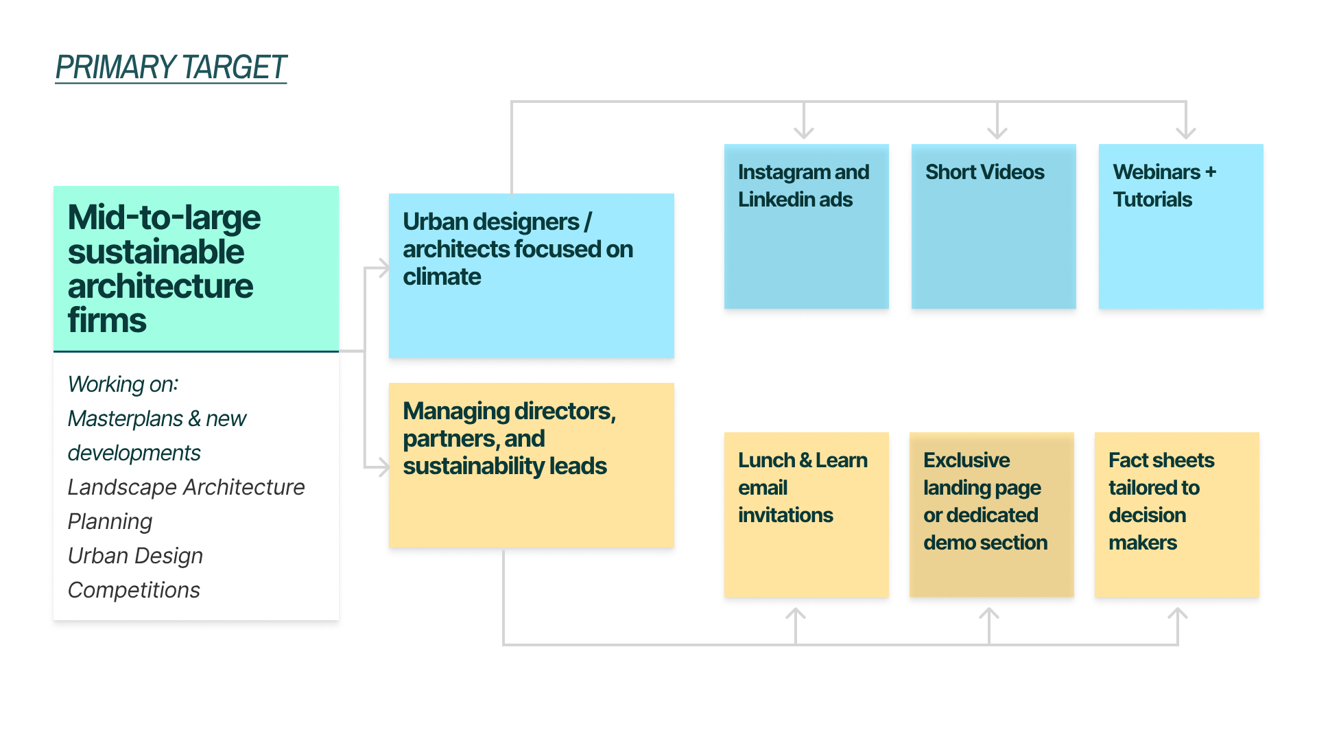
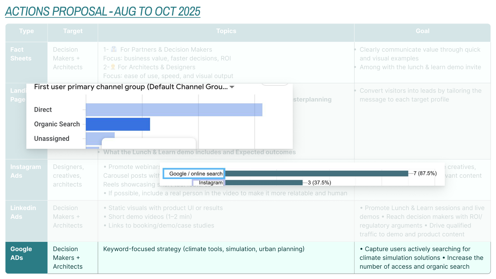
Beyond product design, I led the communication strategy: mapped audiences, ran a user survey, defined channels, and designed two distinct landing pages for the two most different user profiles.
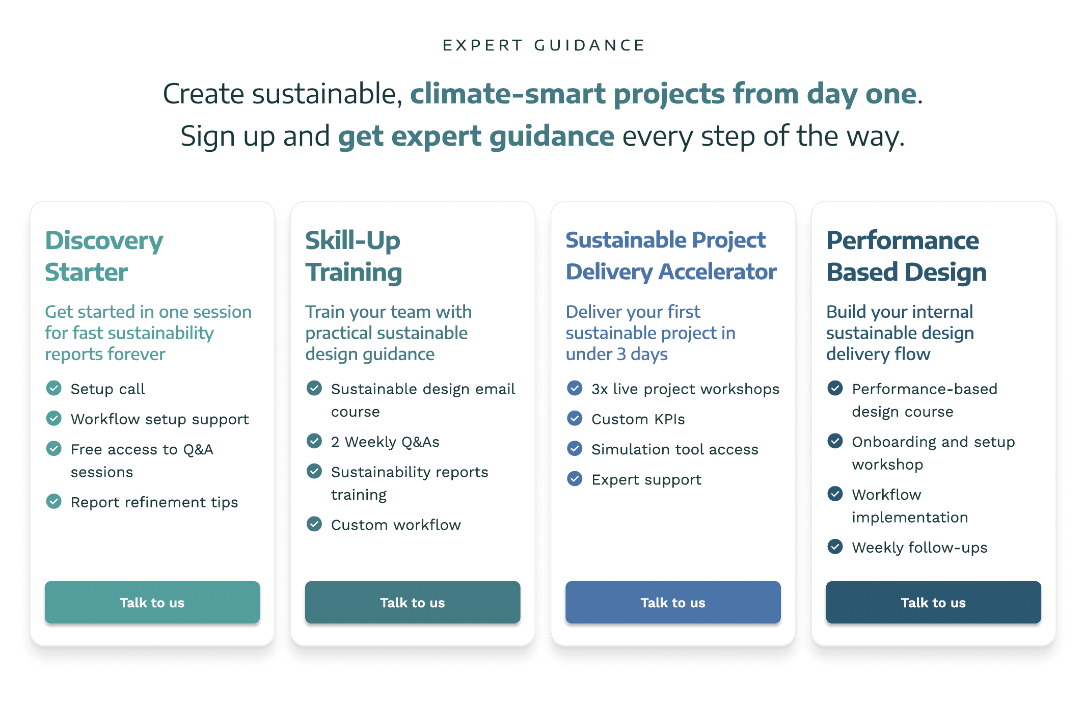
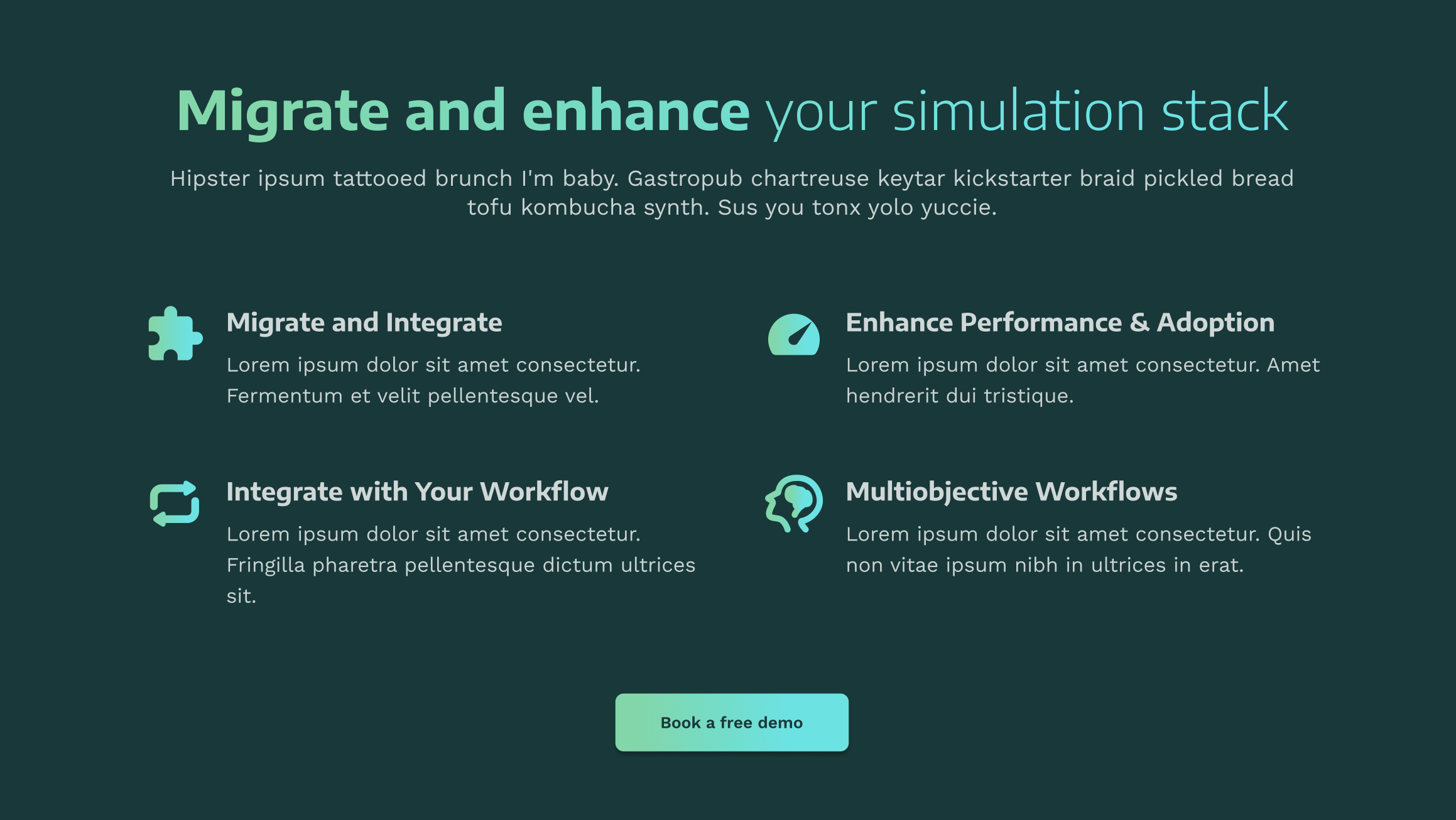
Two versions targeting the two most differentiated user profiles: non-technical architects who need fast sustainability reports, and technical teams looking to integrate simulation into their stack.
These color tokens were part of infrared.city's existing brand palette. I used them as a foundation and introduced gradients between the tones to bring a more contemporary feel to the visual system.